Todays scrapbooking tip is Don’t Expect Perfection. This is something that I struggled with for a LONG time. Since I started implementing a new rule, things have gotten much better. Want to hear what that rule is?
You need to like it, you don’t need to love it.
It used to take me HOURS to create a layout. I wouldn’t stop fussing with it until everything was perfect and I loved it. Needless to say I wasn’t getting very much accomplished.
I asked myself what my goal was for my albums. Did I want them full of layouts that were perfect or did I want to get my photos into albums and stories told? Because, in reality, the people who are flipping through your albums are not going to notice whether the pages are perfectly designed or whether a title is stamped straight or the colours coordinate. They are looking at the photos and reading the journaling!
When I realized this, it was like a weight was lifted off my shoulders. With this new rule implemented, I getting things accomplished!
Todays Inspiration
I have two layouts to share with you today. I love one and I like one. But that’s two more layouts to be added into my 2018 album. I’m that much closer to finishing up last year! Woohoo!
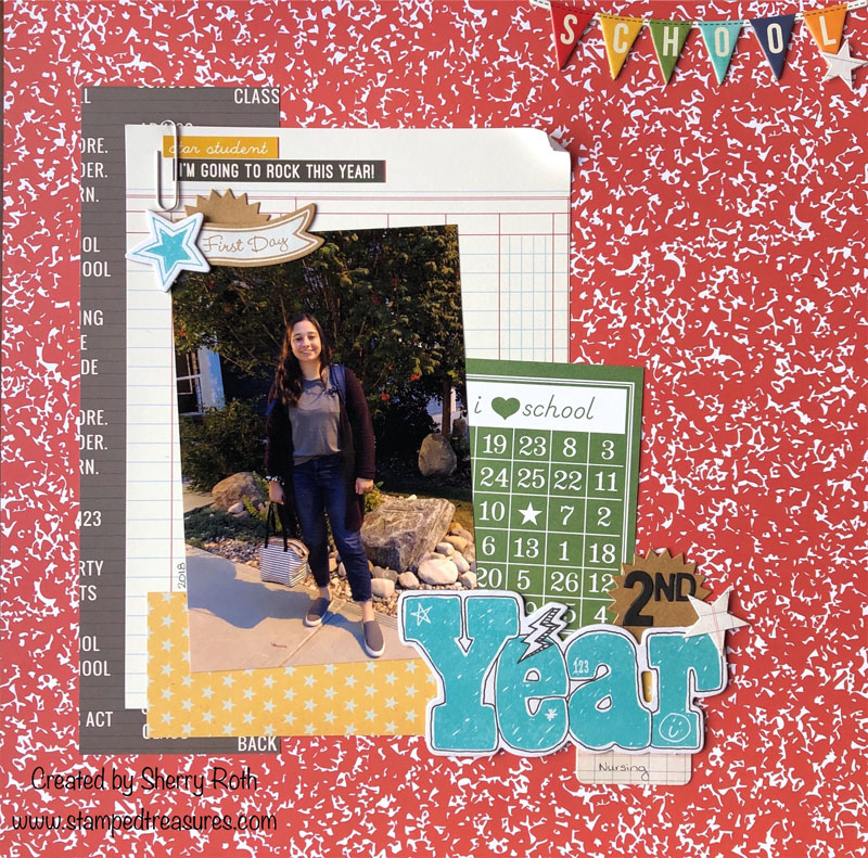
This first layout is of my daughter’s first day back at University (last year). I like the layout but I don’t love it and here’s why.
- The photo isn’t the best. The lighting is terrible and there are so many shadows. But it was the time of day and I tend not to spend a lot of time editing my photos.
- I’m a white card stock background lover and this patterned paper is BUSY for me. I like it because it screams back to school but it’s not my usual style.
- Normally I stick with one collection so that everything coordinates nicely. This layout uses 2 Simple Stories collections – School Rocks (2018) and Smarty Pants (2013); some Close to My Heart and a bit of Stampin’ Up! It’s a hodge lodge of things. Again not my usual style.
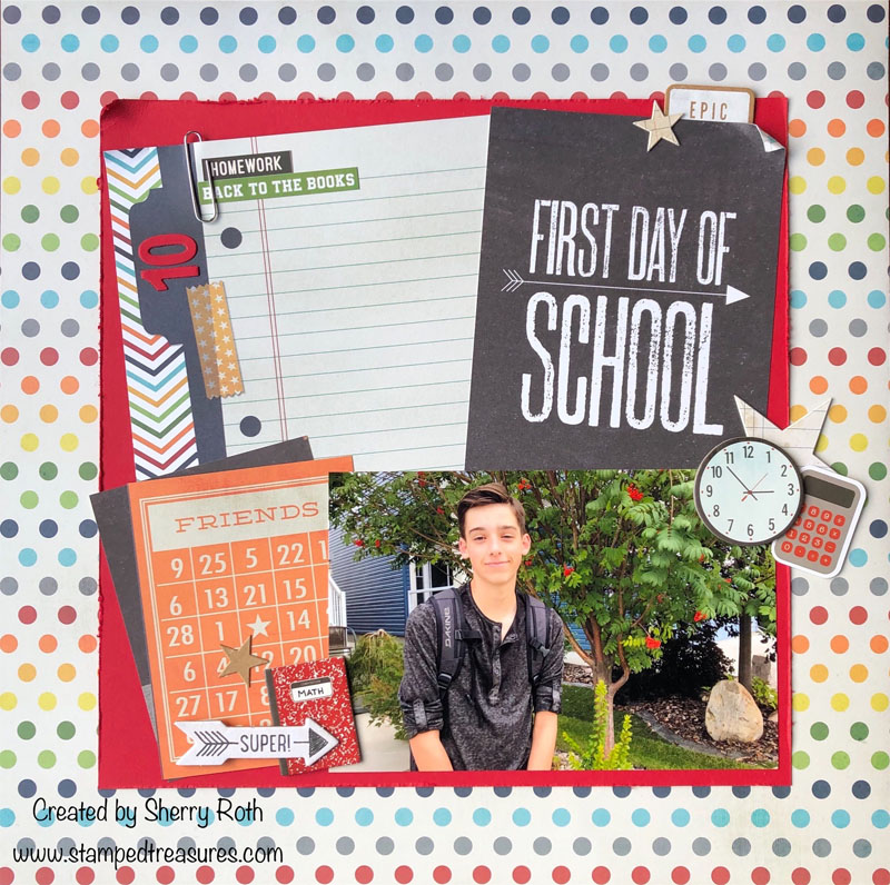
This second layout is of my sons first day of grade 10. I love how it turned out. And the funny thing is it’s not my usual style either but for some reason it appeals to me a bit more than the first one. Maybe it’s because the photo is better or the background not so bright. I’m not sure what it is.
What are your thoughts? Which is more appealing to you?
Have a creative day!


Leave a Reply